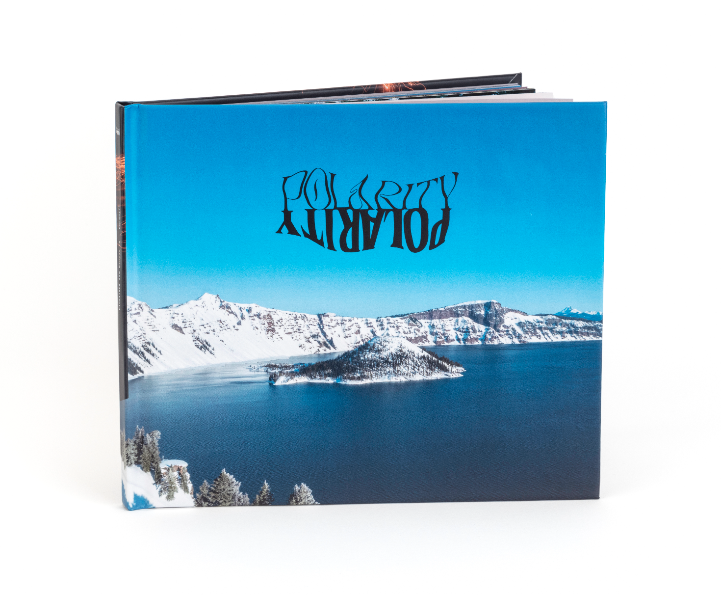
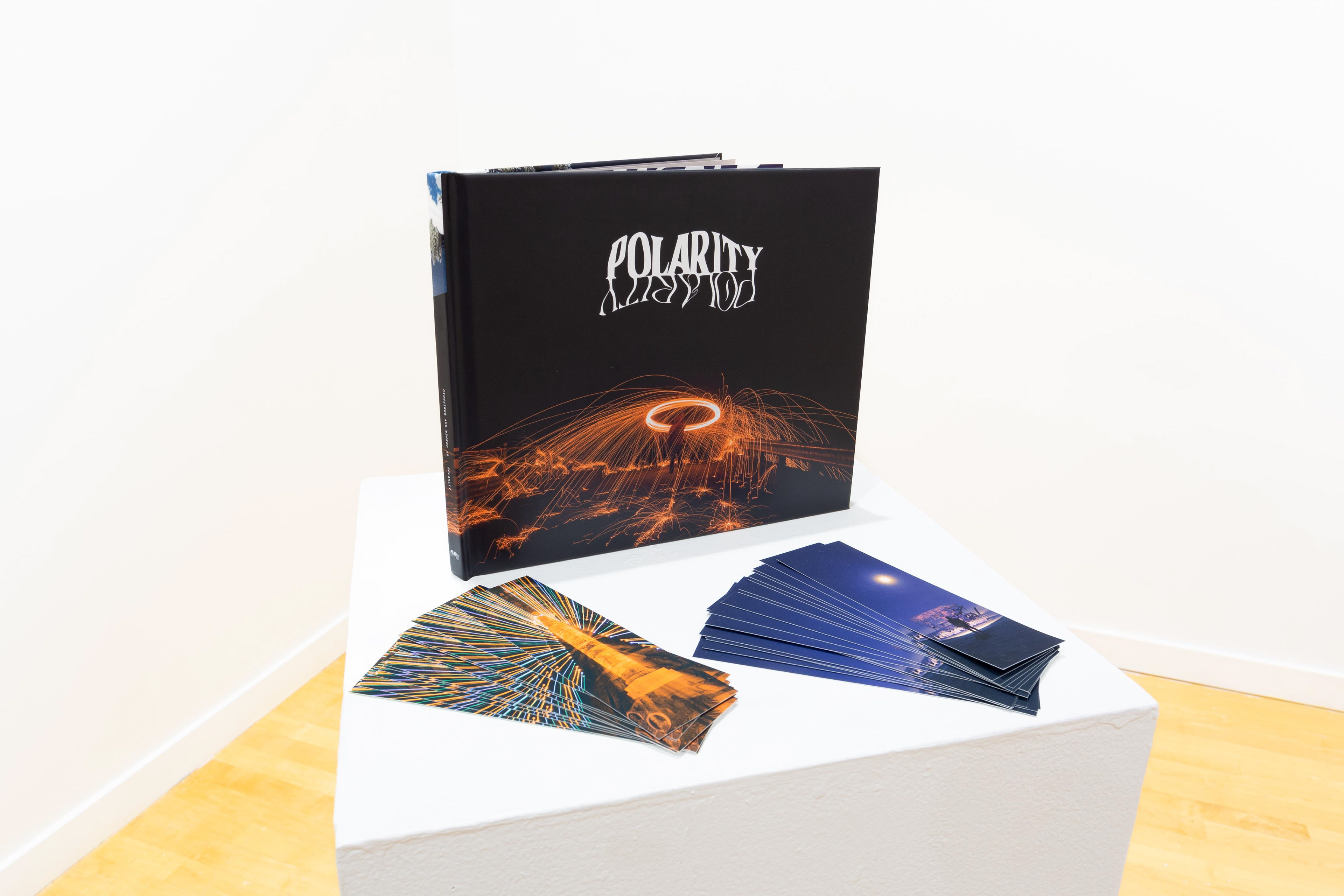
Polarity
The title of my book, Polarity, means “the state of having two opposite or contradictory tendencies, opinions, or aspects.” This theme is important to me because it shows two opposing styles of design, photography, and writing, proving that neither is better or worse, and each serve their own purpose. This also proves that there are different solutions and routes to make a project using the same subjects and locations and have them be vastly different. This book also aims to show how my design and photography works together successfully and still look like a cohesive body of work. My biggest goal however, is that I want people to sit down and enjoy reading short stories on my adventures while looking at an array of pretty pictures.
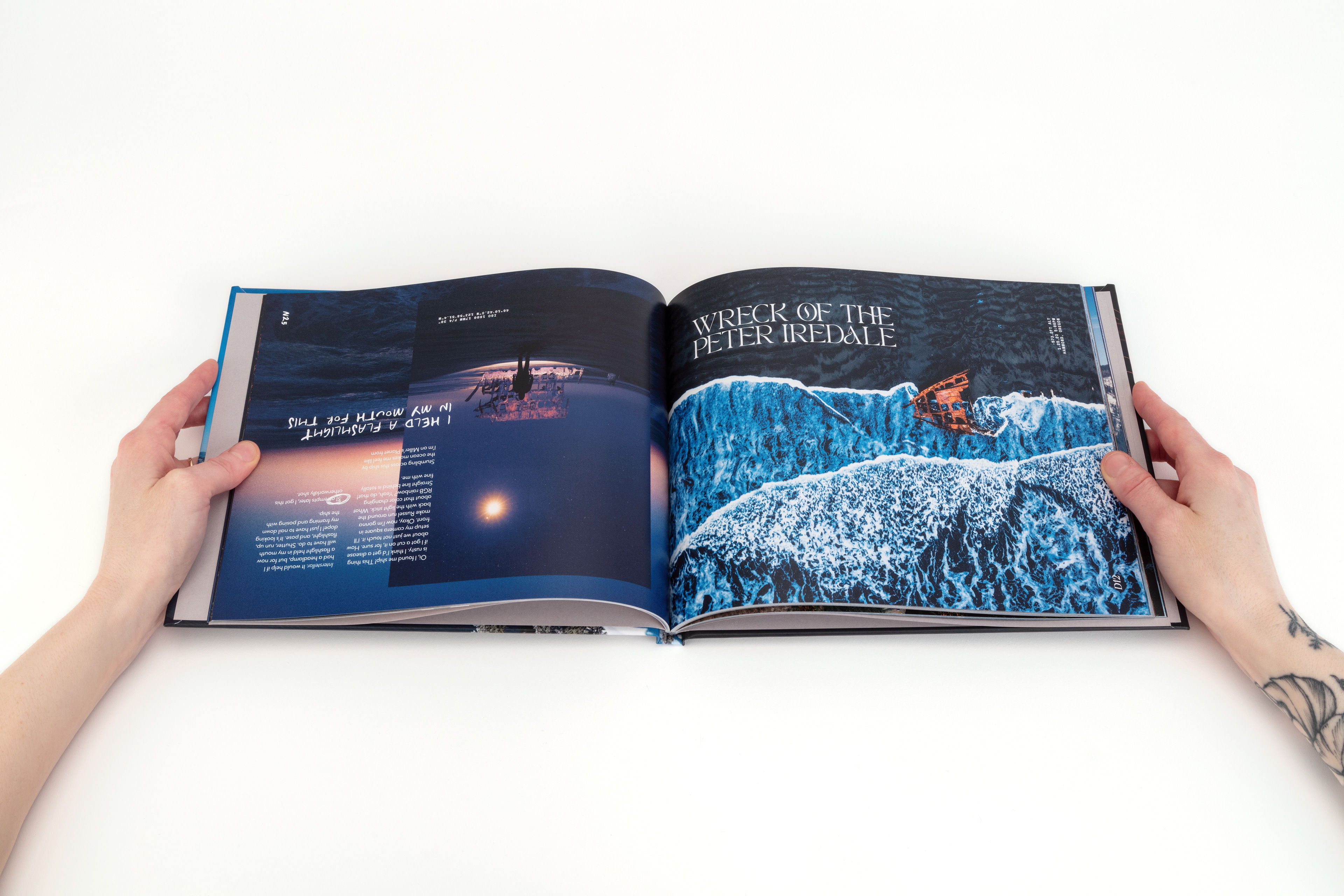
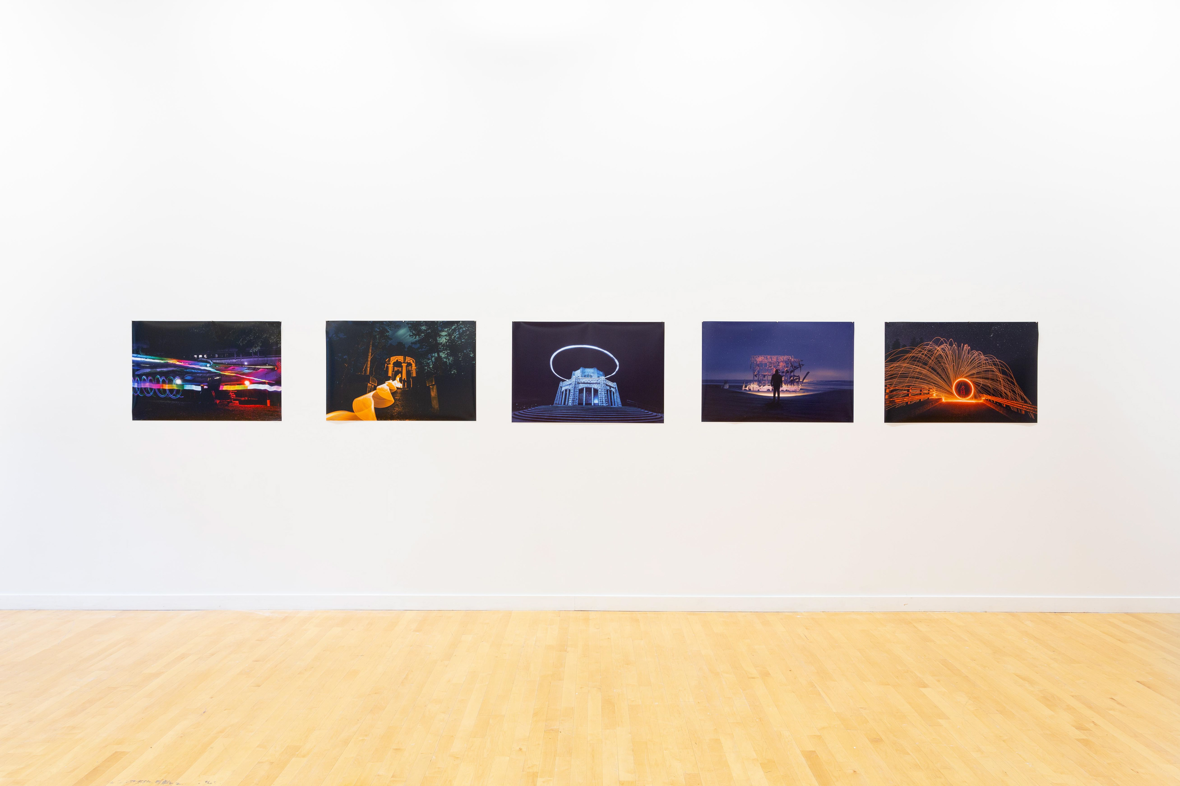
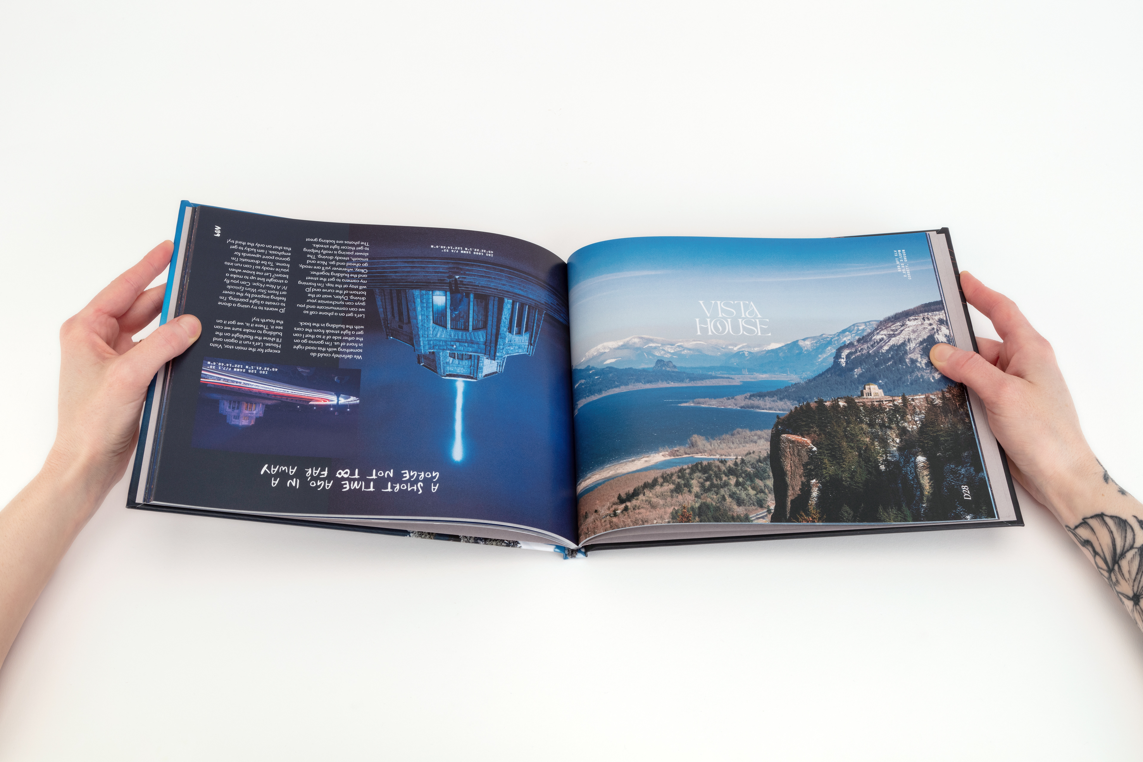
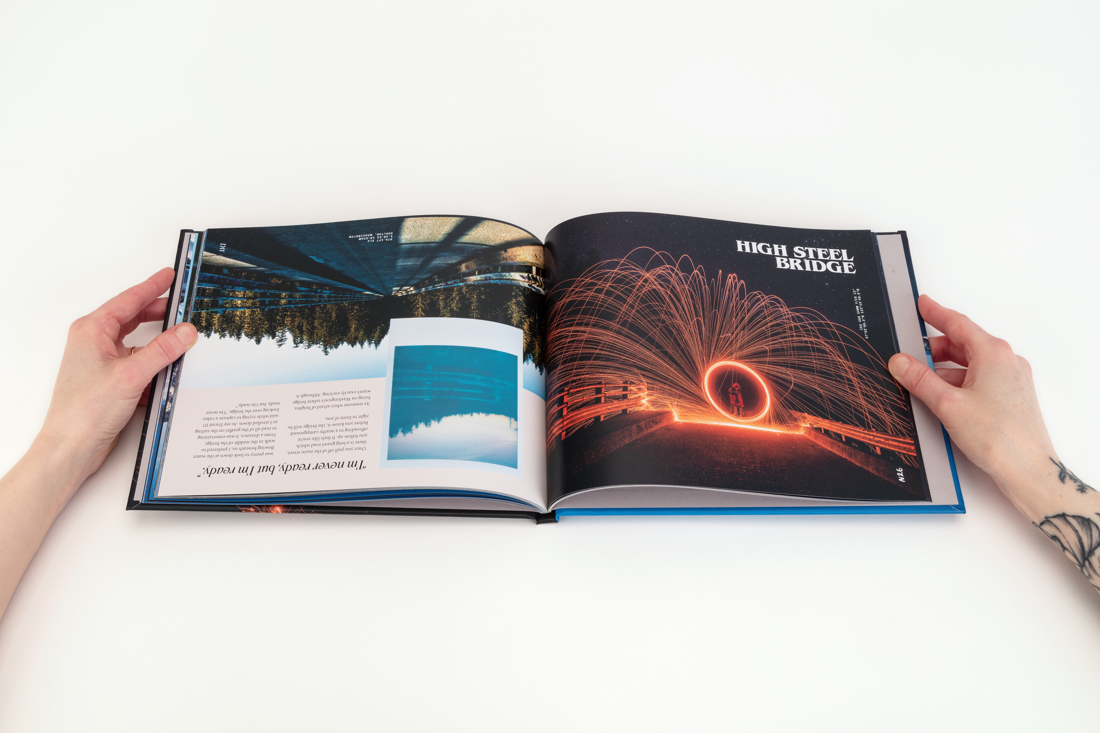
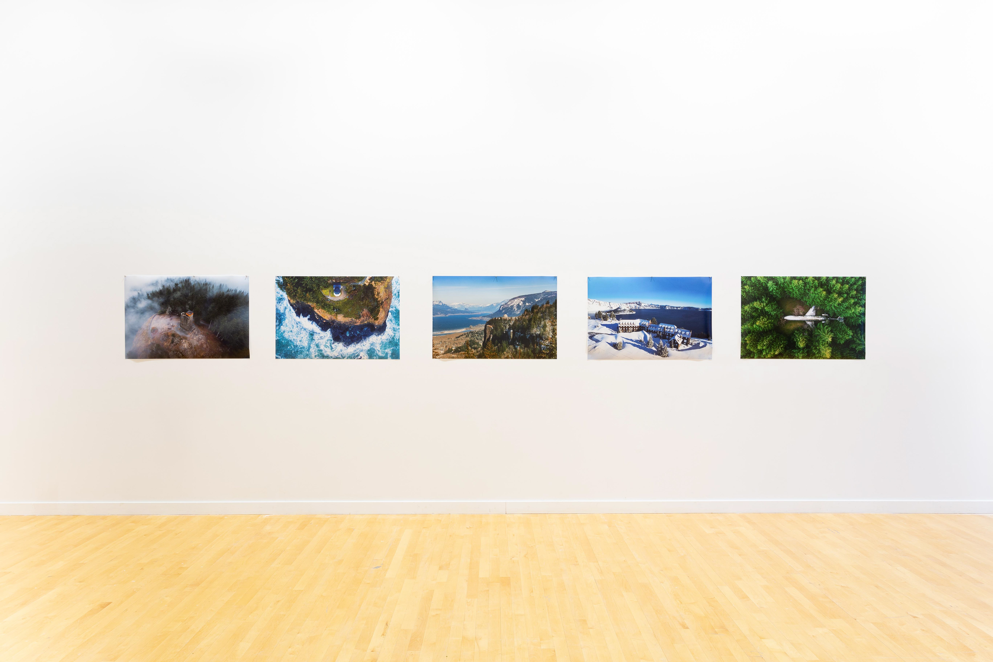
My photo book features architectural landmarks around the Pacific Northwest. These landmarks are all isolated in nature. The book is split into two parts: day time and night time. Throughout the book, the opposing parts are flipped upside down from each other in a single spread, which allows the viewer to start from either side of the book as well as read it from either direction. Along with design and photography, there’s also a non-linear narrative story written for each location, for both parts.
For this project, I had to be my own creative director, manager of time, photographer, designer, writer, and occasionally my own model. Once I figured out my main concept, I made a long list of potential places to visit. From there, I set parameters and began narrowing down my list. Each location had to follow these three rules: 1. The location must be human made. 2. The location must be isolated away from the city. And 3. The structure must be a landmark of significance in some way. After these rules were set in place, I ended up settling on 15 locations for my list.
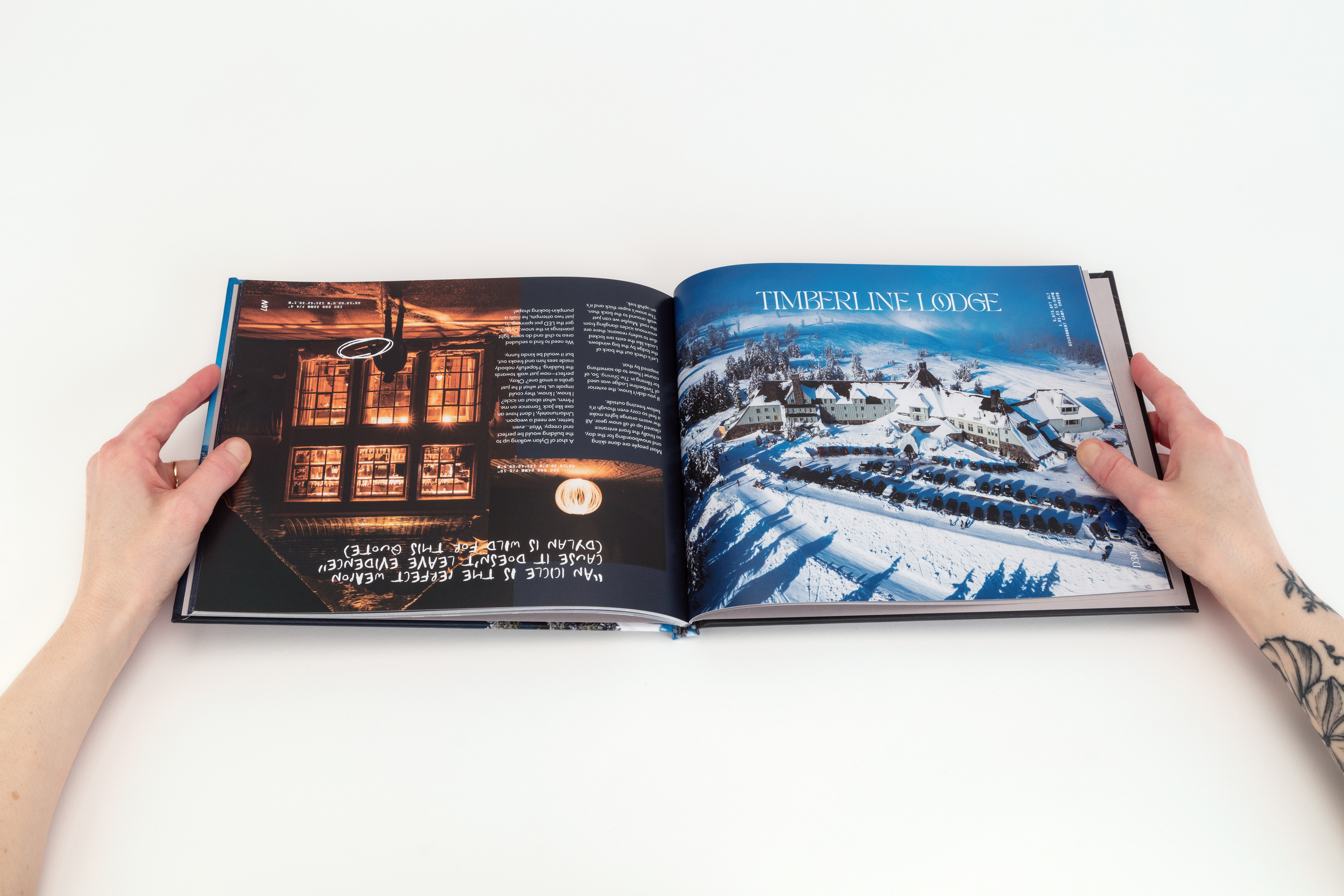
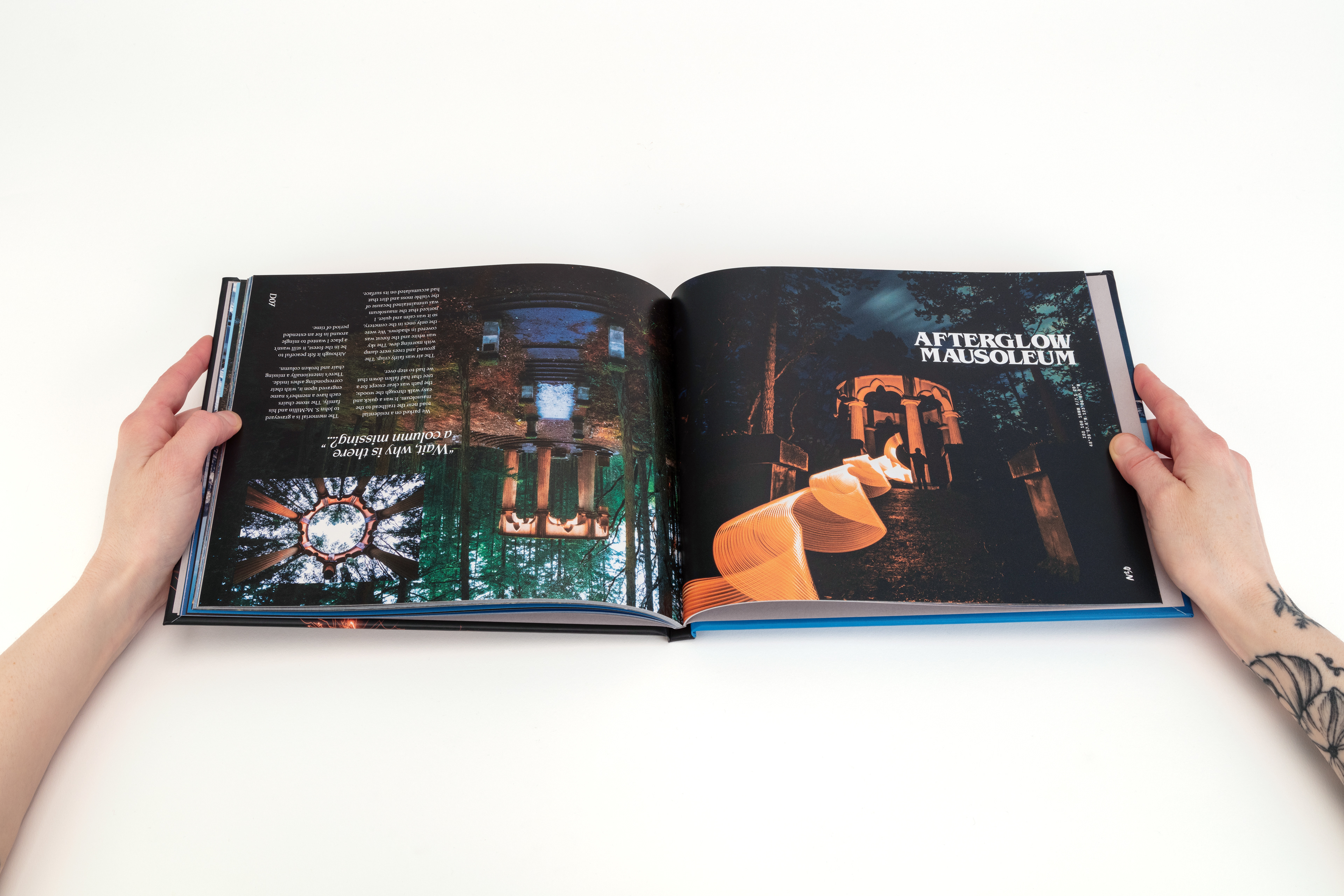
I started this by experimenting with different compositions. I scribbled around 60 different layouts in my sketchbook. I played around with different variations of hierarchy, scale, and balance. I then recreated all of the sketches digitally in InDesign, with placeholders. Once I picked out a handful of favorites, I plotted in my own images over the placeholders to see how they were working together on a page. The pages all had a different number of photos, some with up to 2-3 and others with only a single image. This led me to the idea of creating an intro for each location that features a photo covering the entire page. The second page of each location serves to show more details on the structure by giving different perspectives on it. Once I started putting in my own photos, I began to create a flow between the spreads and ended up using many of the same layouts throughout the book.
After I filled the book with all of my favorites, I began my exploration with typography. I knew that each side would have to be drastically different to give opposing moods. For the day side, I wanted it to feel beautiful and elegant, with an ornate yet modern title font. I experimented with many serif display fonts, many of which were from Tan Type Co. I ended up settling on “PEARL” in all caps, which is exactly what I was looking for to fit the aesthetic. PEARL has thick and thin wavy lines that flow so seamlessly in a brush-like manner but much more refined. It has embellishments throughout the letterforms, particularly on the crossbars sitting at the x-height. I used as many ligatures as possible, which made such a smooth connection between two letters.
For pull quotes, I wanted something that was bold enough to stand out, but slim enough to not overtake the page. I played with different italicized fonts until I found Apocalypse Revelations from Blaze Type. This font compliments PEARL and doesn’t feel like it wants to compete with hierarchy. The stem is fairly thick, and has dagger-like ascenders and descenders, giving it a calligraphic style.
Finding the right body text was tricky, but it was even more difficult to find the best point size, tracking space, and leading distance to be pleasing and easy on the eyes for readability. Having the baselines set further apart meant bodies of paragraph text didn’t look and feel as cramped. White space was important for me to have around the text because I wanted to welcome the reader without any complications. After going through numerous fonts and combinations of settings, I finally settled on the serif font Calluna for the body type. The most challenging part of this process wasn’t just to find good looking typefaces, but it was to make sure that all of them fit together well on a page.
On the night side, I wanted it to feel a bit more intense and horror-like. During mid-terms, I told my panel of designers that this book was aimed to encourage people to visit these locations. However, they didn’t get that vibe from seeing how spooky some of my pictures are. That’s when I realized that I wanted to lean a bit further into the dark side and embrace the horror essence. For the title pages, I used the classic 80s style font, ITC Benguiat, which is used on many Stephen King novel covers as well as the Stranger Things title card.
To continue the murdery-vibe, I wanted a scratchy handwritten style font for the pull quote, which MANIC was perfect for. At first, I attempted to handwrite this myself, but my penmanship just kept turning out too bubbly and cute. Plus, it was just much faster to be able to use a computer font. My favorite thing about the MANIC font is that it also has two sets of alternative characters and symbols, so I was able to use those throughout the book and make it look less obvious that it was created digitally.